Signs of Distribution Are Everywhere
(Written by Bert Dohmen, contains excerpts from our July 6, 2025 Wellington Letter)
The stock market is now fulfilling our predictions of huge optimism being created going into an important top.
Yesterday (July 7) we saw a number of important indices and stocks open on breakaway downgaps. That’s a bearish preliminary signal. However, we can’t claim victory yet. We still need a week or two to get confirmation.
In our last article on Zerohedge from June 24 titled, “A New Record High Will Set The Perfect Bull Trap,” we explained why investors should be weary of a few major indices rising to all-time highs.
With the S&P 500 just reaching a new all-time high on Thursday (July 3), we found that only about 8% of the stocks in that index were also at a new high.
That means 92% of stocks are still lagging the index (i.e. 464 out of 503 of the stocks in the S&P are not at new highs).
The NASDAQ-100 index also set a new high last Thursday, but only 8% of those stocks also made a new high. This is what bull traps look like in the early stages.
For the year, the Nasdaq-100 is up around 8.8%, but Apple and Google, two of the greatest firms in the US, are down on the year. Amazon is up just marginally.
We have written that signs of distribution are everywhere. That is when the big smart money unloads their stocks on the inexperienced public. One sign of distribution is when one-day moves have a few spectacular stock gainers to attract the last bulls, similar to the past week. Then on days when the market is down, the majority of stocks decline but in a non-spectacular fashion.
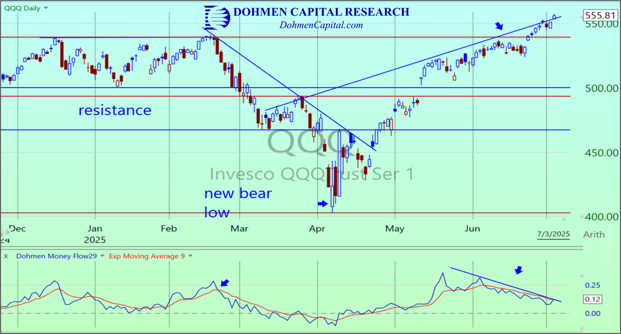
Let’s look at some charts. The QQQ is the ETF for the Nasdaq-100. Note that it made a new high over the past week as we expected, but there has been a big bearish divergence with the Dohmen Money Flow (bottom), which has declined while the QQQ went up. However, late last week the Dohmen Money Flow started rising, which is likely just a normal wiggle.
We are always alert to signs that our forecast may not be working out. If the upside breakout in the QQQ continues for several weeks or more, it would be bullish, especially if the Dohmen Money Flow continues to rise.
However, if the trend of the QQQ reverses downward, it would be bearish, as it would fit the signs of a “bull trap” closing.
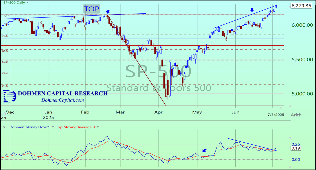
The daily chart of the S&P 500 index looks similar to the QQQ chart above, including the bearish divergence with its own Dohmen Money Flow until late last week, when money started flowing back into the S&P (bottom of chart).
Of course, this is a more manipulated index, which means it could give a lengthier upside breakout by just pushing up a few big cap stocks. About 10 stocks out of 500 make up much of the movement of the index.
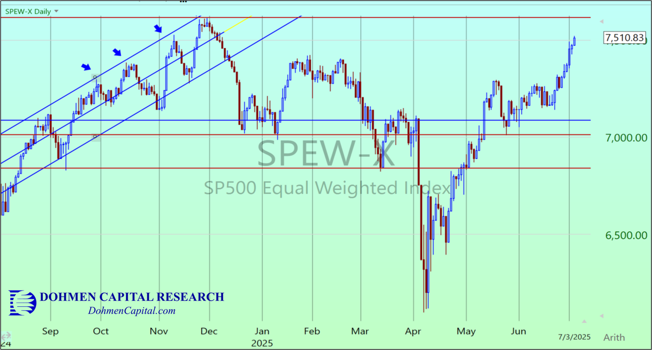
A more relevant index is the “equal weight” S&P 500, the SPEW (not cap-weighted). This is still not yet at a new high.
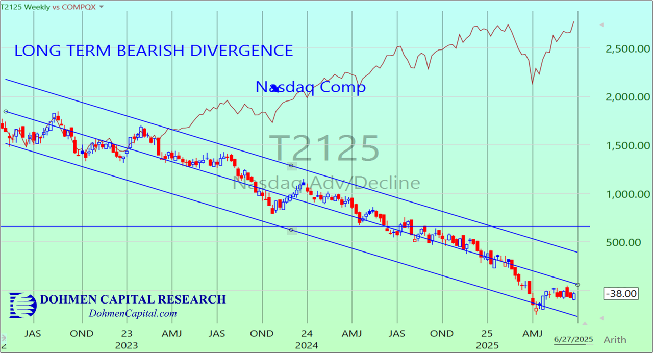
Look at the long-term (weekly) chart that shows a huge bearish divergence between the NASDAQ Comp (red line)and its advance/decline line (candlesticks). This shows that the majority of stocks within the NASDAQ Comp have been sold the past 2 years while the big cap stocks in the index have been manipulated higher. Since the NASDAQ is a cap-weighted index, the big cap stocks therefore have heavy influence on the index’s performance.
Such a long term divergence is unusual. It could be that money managers are all focused on perhaps 15%-20% of stocks and ignoring the rest. This could be a long-term behavioral change.
CONCLUSION: We always ask ourselves where we would decide that this is an important start of a bull market rise, instead of the final phase of a very big short squeeze rally. There are of course numerous factors we consider, including Fed monetary policy, which is the major controlling influence.
That’s because the Fed creates the money that makes bull markets. Look at the Covid Crash in 2020. The world economies were collapsing. But then the Central Banks, led by the Fed, injected TRILLIONS of freshly created money into the financial system. That overcame all the very negative economic fundamentals.
We introduced the Dohmen Theory of Credit & Liquidity about 50 years ago as a great guide. It says that the primary determinant of the major investment trends are Credit and Liquidity. It is not earnings, dividends, buybacks, etc. that other analysts talk about. Those are just the ripples of trends in credit and liquidity.
We discuss this in more detail in our latest Wellington Letter, published this past Sunday, July 6. We also explore the following critical topics in this issue:
- Can the stock market rise nicely when interest rates double or triple?
- Or can stocks decline when the Fed cuts interest rates?
- Why are “rising interest rates” not necessarily “tight money"
- Why Bitcoin cannot replace Gold
If you wish to continue reading more about our market analysis, you can gain instant access to our latest issue by clicking this link.
After becoming a member, you will not only gain instant access to this issue, but also to our most recent issues over the past 2 months. We hope to welcome you as a valued member soon.
Wishing you successful investing,
Bert Dohmen, Founder
Dohmen Capital Research
Editor, The Wellington Letter


