





The Fed is Going to Ignore Another Weak Jobs Report
The analysis below covers the Employment picture released on the first Friday of every month. While most of the attention goes to the Headline Report, it can be helpful to look at the details, revisions, and other reports to get a better gauge of what is really going on.
Current Trends
The jobs report showed a meager gain of 29k jobs in the month of September. This follows the “strong” August report of 162k which has now been revised down to 133k jobs. The bigger surprise is the second strong month of the household survey which showed a gain of 406k which followed 569k added in August.
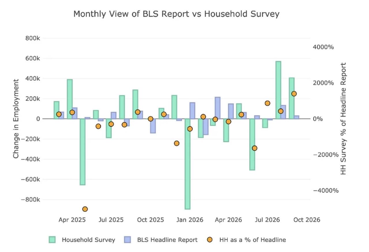
Figure: 1 Primary Report vs Household Survey – Monthly
Despite the massive outperformance in the Household Survey, when looking at the YTD number, it still underperforms. For the year, the Headline Report shows a gain of 612k vs the Household Survey which shows a loss of 840k.
So, even with two very strong months, the Household Report still shows an extremely weak job market. Outside of Covid, this is the worst year for jobs since at least 2010 according to the Household Report. It’s also the only year where the two reports are moving in opposite directions, as seen in the chart below...
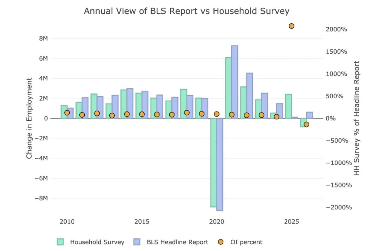
Figure: 2 Primary Report vs Household Survey – Annual
The BLS publishes the data behind their Birth/Death assumptions (formation of new business). The data showed that the BLS assumed a loss of 190k jobs for September. This is the first month since March where the assumed jobs was actually negative...(READ THIS FULL ARTICLE 100% FREE HERE).